Monday, November 26, 2018
Friday, November 16, 2018
4 Websites
Spiral Staircases:
http://petapixel.com/2014/12/19/disorienting-beauty-spiral-staircases-old-abandoned-buildings/
On the website, I looked at different images taken by Christian Richter, who photographs abandoned staircases. The images are taken in a variety of different homes, from different angles and perspectives, to capture the outdated but intricate spiral staircase.

1) I picked this photo because I liked the variety of colors and textures incorporated.
2) I see the rule of lines and the rule of thirds present in this photo.
3) Christian Richter took this picture.
Making A Projection
https://petapixel.com/2015/01/01/projector-brought-forest-turns-nature-glowing-wonderland/
On this website, I learned that projections can be displayed on a multitude of surfaces, including the forest. The article explained how two artists used projections to capture different photos.

1) I picked this photo, because the way the projection illuminates the frog is very interesting to look at.
2) The rule of simplicity and avoiding mergers is present in this picture.
3) Tarek Mawad took this photo.
Style
https://petapixel.com/2014/08/25/approaching-problem-style/
The website mostly explains different ways for photographers to express their own style, avoiding cliches. To develop style, you should step outside of the box and take pictures that excite you.
1) I picked this photo, because I like the red that is prominent in it.
2) The rule of simplicity and rule of thirds is present in this photo.
3) Robin Walker took this photo.
Photos Everyone Should Know How to Make
https://petapixel.com/2014/12/01/6-types-photos-know-make/
The website explains different techniques that all photographers should know how to do. These techniques include taking 360 photos, and taking forced perspective photos etc.

1) I picked this photo, because I liked the purples and blues within the pictures.
2) The rule of framing and simplicity is present in this photo.
3) Jeff Meyer took this photo.
http://petapixel.com/2014/12/19/disorienting-beauty-spiral-staircases-old-abandoned-buildings/
On the website, I looked at different images taken by Christian Richter, who photographs abandoned staircases. The images are taken in a variety of different homes, from different angles and perspectives, to capture the outdated but intricate spiral staircase.
1) I picked this photo because I liked the variety of colors and textures incorporated.
2) I see the rule of lines and the rule of thirds present in this photo.
3) Christian Richter took this picture.
Making A Projection
https://petapixel.com/2015/01/01/projector-brought-forest-turns-nature-glowing-wonderland/
On this website, I learned that projections can be displayed on a multitude of surfaces, including the forest. The article explained how two artists used projections to capture different photos.
1) I picked this photo, because the way the projection illuminates the frog is very interesting to look at.
2) The rule of simplicity and avoiding mergers is present in this picture.
3) Tarek Mawad took this photo.
Style
https://petapixel.com/2014/08/25/approaching-problem-style/
The website mostly explains different ways for photographers to express their own style, avoiding cliches. To develop style, you should step outside of the box and take pictures that excite you.
1) I picked this photo, because I like the red that is prominent in it.
2) The rule of simplicity and rule of thirds is present in this photo.
3) Robin Walker took this photo.
Photos Everyone Should Know How to Make
https://petapixel.com/2014/12/01/6-types-photos-know-make/
The website explains different techniques that all photographers should know how to do. These techniques include taking 360 photos, and taking forced perspective photos etc.
1) I picked this photo, because I liked the purples and blues within the pictures.
2) The rule of framing and simplicity is present in this photo.
3) Jeff Meyer took this photo.
Wednesday, November 14, 2018
Wednesday, November 7, 2018
Magazines Part II
Image Based: Image based magazine covers often feature either a single person, or a main object or landscape. This is the most common magazine and advertising approach, featured prominently in celebrity magazines. For instance, in a celebrity magazine, the magazine team may choose to put the celebrity on the cover, being the prime center of focus.
Illustration Based: Illustration based magazine covers are slightly outdated and seen less frequently, more commonly used in the time before computer generated images were possible. However, The New York Times still uses an illustrated cover. The magazines who do choose to use this cover type tend to be smaller, or may specifically use the image to show something humorous or unique.
Type Based: Similarly to illustration based covers, type based covers are also depicted as rare, though still seen more commonly than illustration based. In choosing a type based cover, there is usually an important message or headline that is meant to be communicated. The words also usually have a unique effect on them, causing them to stand out in your mind.
Concept Based: Concept based magazine covers are a mix of all three types, seen very rarely. These covers are used to create shocking or humorous covers. They are difficult to do well, because the message must be easily understood and funny to readers. This type of cover is usually seen in business, news weekly, or independent magazines.
The words on a magazine cover should correlate to the photo taken, and should be easily understood and communicated. The words should not take away from the picture, but rather add to its overall significance and meaning.
My Favorite Cover
Favorite:
Critique:
On first look, this cover is very successful in grabbing your attention. This factor is established due to the bright colors of the flowers and makeup that is seen on Kendall Jenner's face. However, on first glance, I couldn't identify that the person in the photo was in fact Kendall Jenner. This may be the result of excess photoshopping or alteration of facial features. The dark eyebrows and bright lips also create a very significant contrast to the tone of her skin. The exposure in this photo is also very bright, making it a very eye- catching cover. There isn't much communicated through the cover, but the stark/harsh colors create a very unique quality.
Finalist
Harper's Bazaar
Kendall Jenner, May 2017
"In May of our 150 anniversary year, supermodel Kendall Jenner blew kisses from our subscriber cover with help from photographer Camilla Akrans and a largely forgotten technology known as lenticular printing. A winking reference to a classic Richard Avedon cover from April 1965, it became a collector’s item overnight, proving that, even in our tech-savvy, Bluetooth-enabled world, the simplest solutions can still pack a punch."Kendall Jenner, May 2017
Critique:
On first look, this cover is very successful in grabbing your attention. This factor is established due to the bright colors of the flowers and makeup that is seen on Kendall Jenner's face. However, on first glance, I couldn't identify that the person in the photo was in fact Kendall Jenner. This may be the result of excess photoshopping or alteration of facial features. The dark eyebrows and bright lips also create a very significant contrast to the tone of her skin. The exposure in this photo is also very bright, making it a very eye- catching cover. There isn't much communicated through the cover, but the stark/harsh colors create a very unique quality.
Monday, November 5, 2018
Best Magazine Covers 2013
1) informal
2) environmental
3) formal
4) informal
5) formal
6) formal
7) formal
8) environmental
9) environmental
10) formal
11) formal
12) environmental
13) formal
14) environmental
15) formal
16) informal
17) environmental
18) formal
19) formal
20) formal
21) formal
22) formal
23) environmental
24) formal
25) environmental
26) environmental
27) informal
Magazine Tips
1) Create covers that evoke curiosity.
2) Make cover easy to scan/read.
3) Make an emotional appeal.
4) Make cover interesting.
5) Make it worth its price and worth reading.
2) Make cover easy to scan/read.
3) Make an emotional appeal.
4) Make cover interesting.
5) Make it worth its price and worth reading.
Sunday, November 4, 2018
American Soldier
A)
This image is the most powerful, because it shows Fisher carrying his gun, soon to be returning home.
B) The images tell a story by showing the steps in the process of getting admitted to the army, and his journey in the army as well.
C) The captions enhance the photographs by giving the photo a backstory and context.
D) Ian Fisher enrolls in the army, and shortly attends basic training. Fisher does well during training, making friends with peers and superior army members. He's then enlisted in the army, where he struggles to maintain his life within the army and outside it. Fisher battles a couple minor injuries and breakups, but overall remains happy. Fisher soon returns home, eager to see his family and friends.
E) When Ian is the subject in the photos, the caption is usually written in present tense.
F)
1) 1-3 Sentences
2) The first sentence provides the basic information, such as who and when the picture was taken.
3) The second sentence describes what is happening in the photo.
4) The third sentence provides extra information.
5) Some captions do include a quote.
6) There are some captions with four sentences.
G) It's possible to tell a story with just photos and captions, because with those two things, you are able to physically see what is happening, and also apprehend extra background information.
H) It's still important to write stories, because people are able to imagine and determine for themselves what certain scenarios are like.
Friday, November 2, 2018
Self Portrait and Portrait Intro
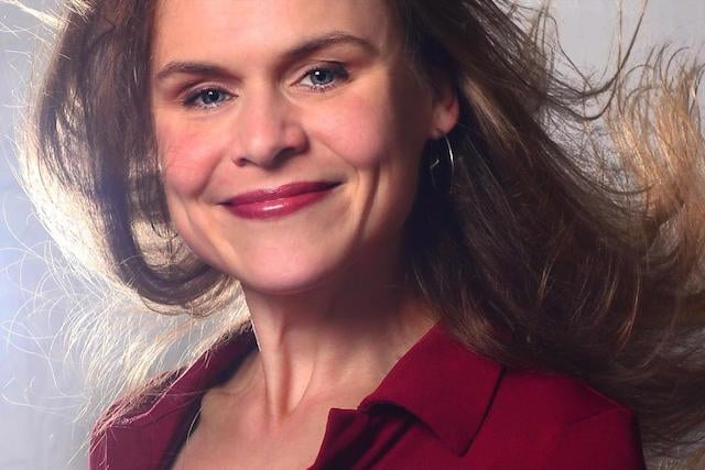
Best tips:


Shoot Candidly
Experiment with Lighting
Environmental:

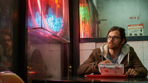
I like this photo because of the reflection in the window and the neon light.
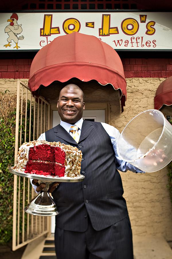
I like how happy the man is in this photo, and the sense of pride you can feel that he has about his restaurant.
Photography:

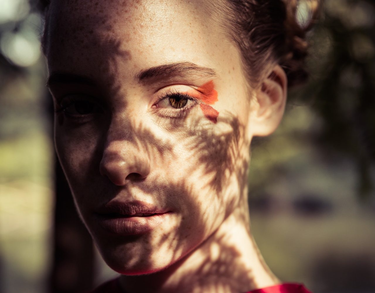
I like this photo due to the lighting.

I like the way the shadows are on the girl's face.
Casual:

I like this photo due to the interesting background.

I like this photo because of the apparent culture that is present in it.
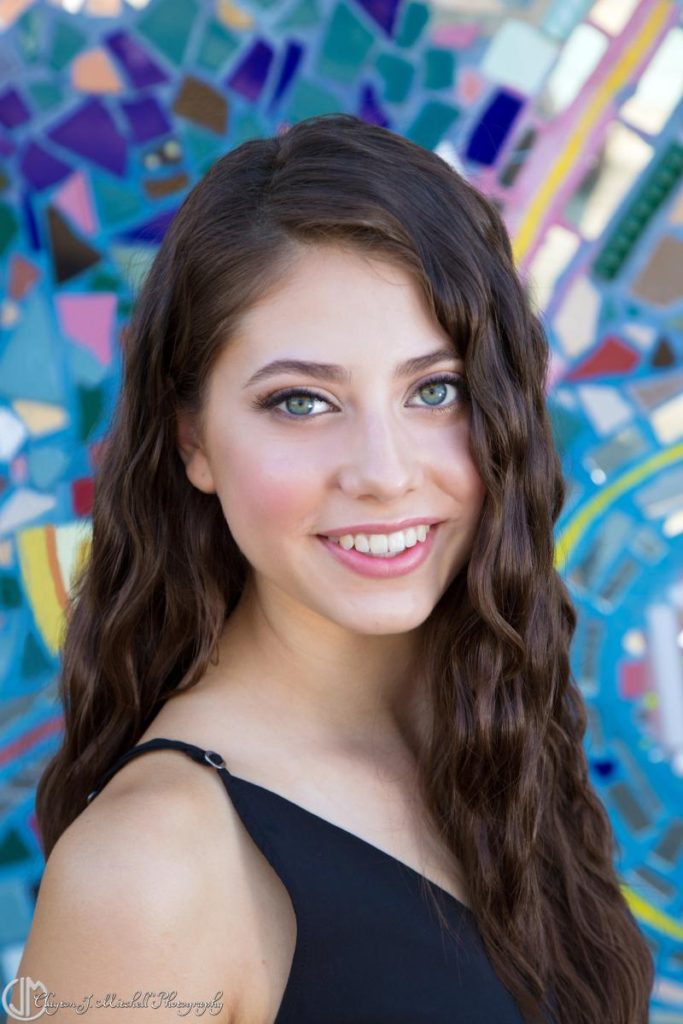
I will shoot my friend, Isabella Reyes. I plan to shoot her at one of our houses, in the backyard. I want to try and get natural lighting, so that her face looks clean and natural. I think that I want the photo to be more candid than staged, just to get a better overall feeling.
Subscribe to:
Comments (Atom)


